What Is CSS? A Simple Guide to the Language That Makes the Web Look Good
A friendly, jargon-free guide to CSS, the language that decides how every web page looks. See Wikipedia with its CSS removed, give one page three different looks, learn how the cascade picks a winner, and how one page fits every screen from a phone to a TV.

On this page
Think of your favorite website. Its colors, its fonts, the way the menu sits at the top, the way the page rearranges itself when you turn your phone sideways. None of that comes from the words on the page. It comes from a second language that works alongside them, called CSS.
CSS stands for Cascading Style Sheets. If HTML is the content of a web page (the headings, paragraphs, links and pictures), CSS is its look: colors, fonts, sizes, spacing and layout. This article explains, in plain language, what CSS is, how it works, and why the web would look like a plain document from 1993 without it.
What happens if you take CSS away
The easiest way to see what CSS does is to remove it. We opened Wikipedia's article about CSS in Google Chrome, took a screenshot, then removed every style sheet from the page and took another:
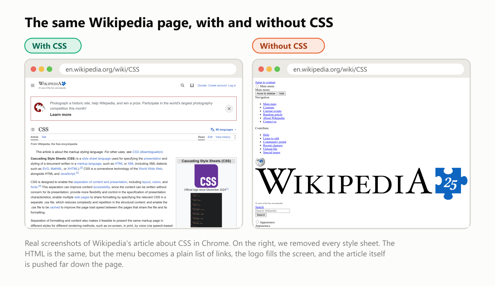
Same page, same HTML, same words. Without CSS, the menu turns into a long list of links, the logo becomes enormous, and you have to scroll a long way to even reach the article. CSS is what turns a pile of content into a designed page.
The parts of a CSS rule
CSS is written as a list of rules. Each rule says "find these elements, and change these things about them":
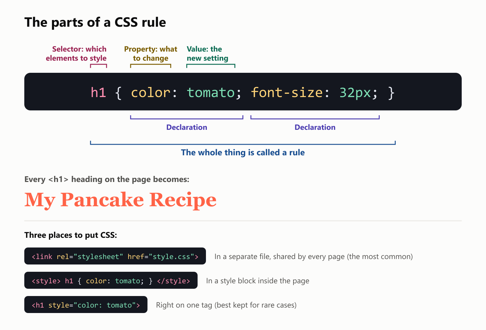
- The selector (
h1) says which elements the rule applies to. Here, every main heading. - A property (
color) is the thing to change, and its value (tomato) is the new setting. Yes, "tomato" is an official CSS color name. - Together, a property and its value form a declaration. A rule can have as many as you like, each ending with a semicolon.
Most websites keep their CSS in separate files, linked from every page with a <link> tag. Change one line in that file, and every page on the site changes at once. That's the whole idea behind the name style sheet: one sheet of style instructions, shared by many pages.
Same HTML, three different looks
Here's the pancake recipe page from our HTML article. We kept the HTML exactly the same and linked it to two different CSS files:
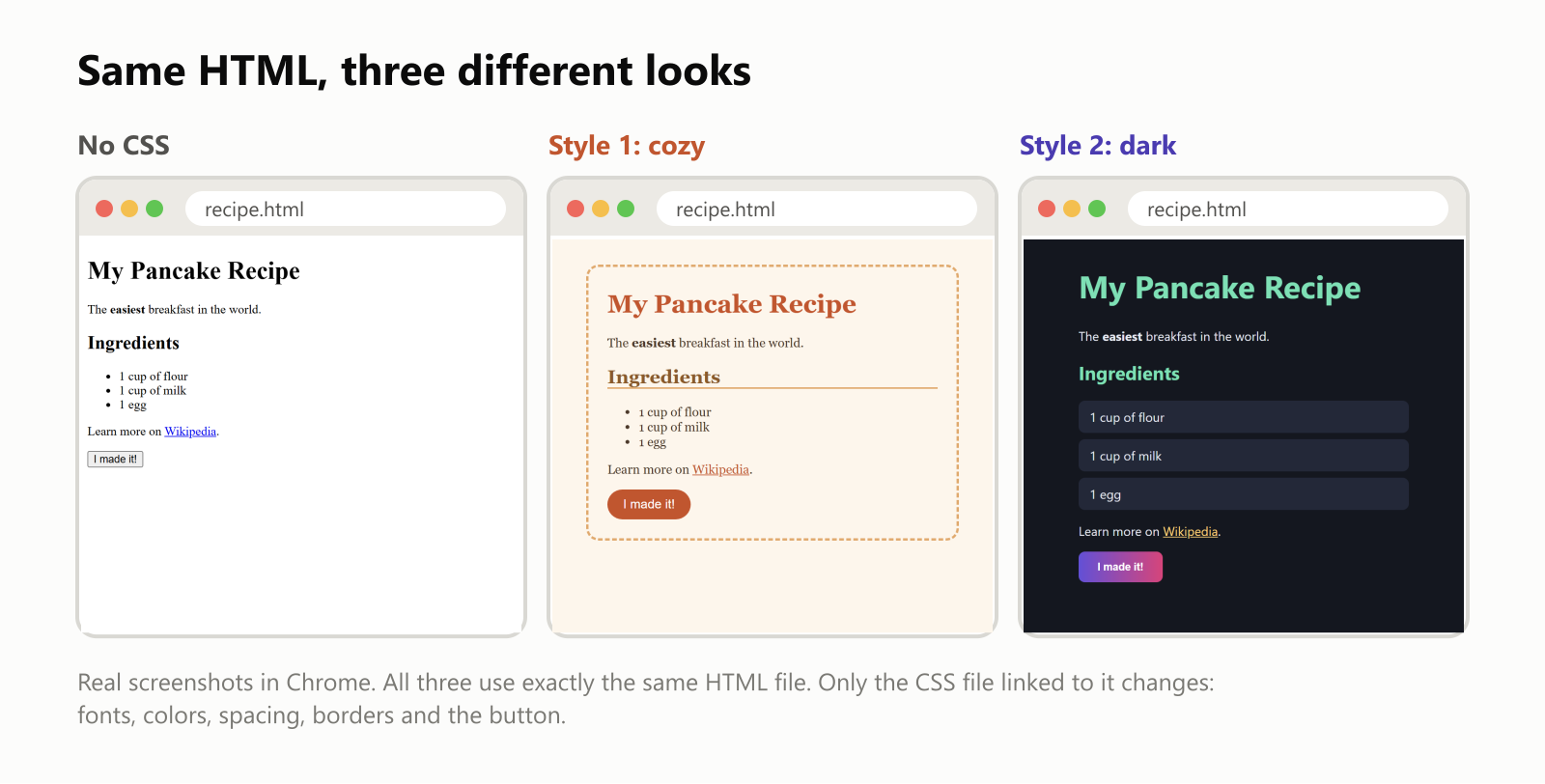
Here's the whole "cozy" style sheet. Even without knowing CSS, you can probably guess what most lines do:
1body {
2  font-family: Georgia, serif;
3  background: #fdf6ec;
4  color: #4a3728;
5  max-width: 420px;
6  margin: 32px auto;
7  padding: 8px 24px 24px;
8  border: 3px dashed #e0a96d;
9  border-radius: 16px;
10}
11h1 { color: #c0562f; }
12h2 {
13  color: #8a5a2b;
14  border-bottom: 2px solid #e0a96d;
15}
16a { color: #c0562f; }
17button {
18  background: #c0562f;
19  color: white;
20  border: none;
21  padding: 10px 20px;
22  border-radius: 999px;
23  font-size: 16px;
24}
This separation of content (HTML) and presentation (CSS) is CSS's big idea. In 2003, a website called the CSS Zen Garden made it famous: it invited designers to restyle one single HTML page using only CSS, and hundreds of wildly different designs came in, from Japanese gardens to comic books, all from the same HTML.
The "cascade": when rules disagree
On a real site, several rules often apply to the same element, and they don't always agree. One rule says paragraphs are blue, another says notes are green. Which one wins? CSS settles it with a set of rules called the cascade, which is where the "Cascading" in the name comes from.
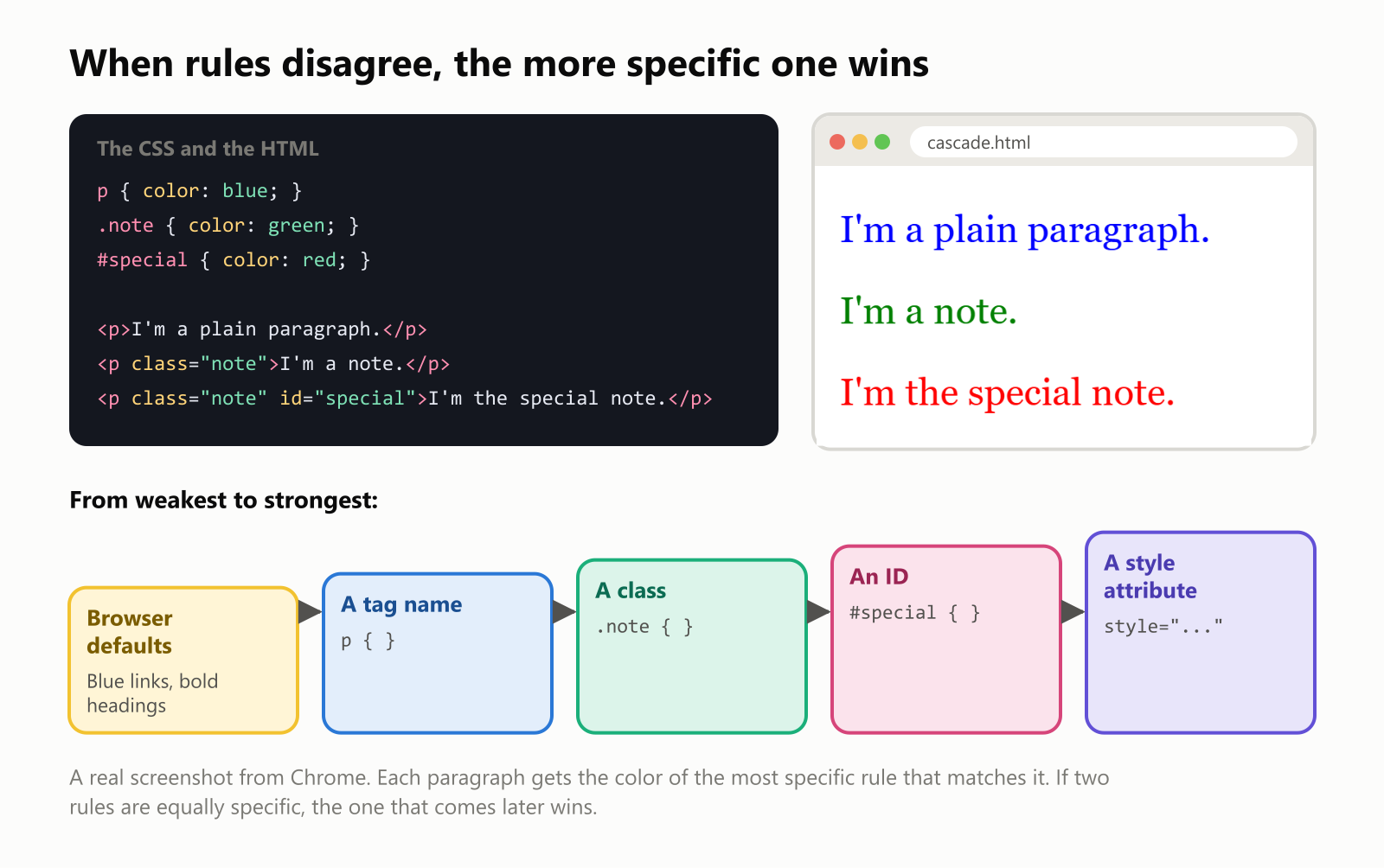
The main idea is the more specific rule wins:
- A rule for all paragraphs (
p) is very general. - A rule for a class (
.note) targets a group of elements you've labeled withclass="note"in the HTML. It's more specific, so it beats the first. - A rule for an ID (
#special) targets one single element, labeledid="special". It's the most specific of the three, so the last paragraph turns red, even though it's also a paragraph and also a note. - If two rules are equally specific, the one that comes later wins.
Some properties are also inherited: if you set a font on the <body>, every paragraph and heading inside it uses that font too, unless a more specific rule says otherwise. That's why one line of CSS can change the font of a whole site.
Every element is a box
To a browser, every element on a page, whether it's a heading, a paragraph, an image or a button, is a rectangle. CSS controls the size of each box and the space around it, in layers:
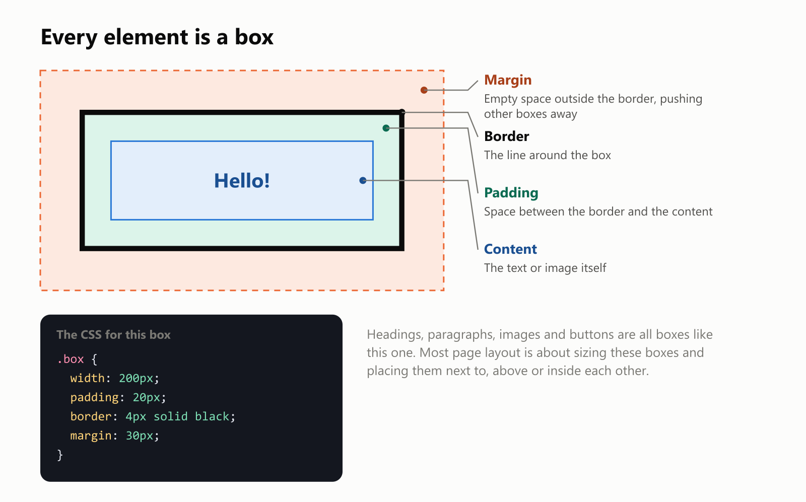
- Content: the text or picture itself.
- Padding: breathing room inside the box, between the content and the border.
- Border: an optional line around the box.
- Margin: empty space outside the border that keeps other boxes at a distance.
This is called the box model, and once you know it, web pages start to look like what they really are: boxes inside boxes. A web designer's job is mostly deciding how big those boxes are and where they go. Modern CSS has powerful tools for that, called Flexbox (for lining boxes up in a row or column) and Grid (for arranging them in rows and columns, like a spreadsheet).
Colors in CSS
CSS gives you several ways to write a color. These four all mean exactly the same shade of red:
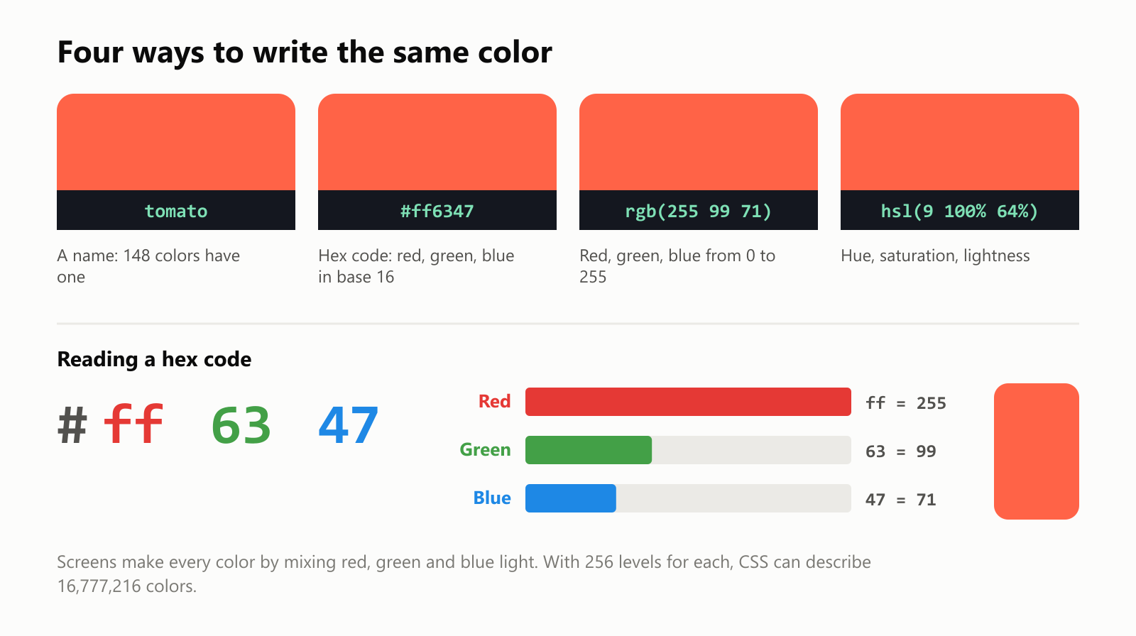
The odd-looking ones, like #ff6347, are called hex codes. Every screen pixel is made of tiny red, green and blue lights, and a hex code says how bright each one is, using two digits each in base 16 (where the digits go from 0 to 9 and then a to f). ff means 255, full brightness. So #ff6347 means "red all the way up, a bit of green, a bit of blue": tomato red. Designers usually pick colors with a color picker, and the picker writes the code for them.
One page, any screen
Today, most visits to websites come from phones, so a page must look good at any width, from a small phone to a huge TV. This is called responsive design, and it's done with CSS:
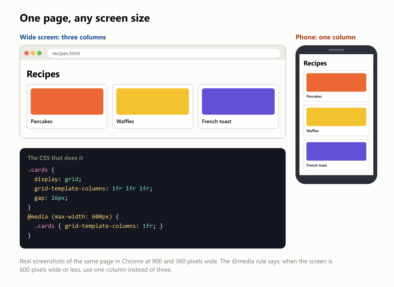
The key is the @media rule. It says "only apply these styles when the screen matches this condition." Here, when the screen is 600 pixels wide or narrower, the three columns become one. The HTML is exactly the same on both screens; the browser simply applies different CSS.
The same trick powers other things you may have noticed: sites that switch to dark mode when your phone does, and pages that print neatly without menus and ads.
Inside a real page's CSS
How much CSS does a real site use? We loaded Wikipedia's article about CSS in Chrome and counted all the style rules the page uses:
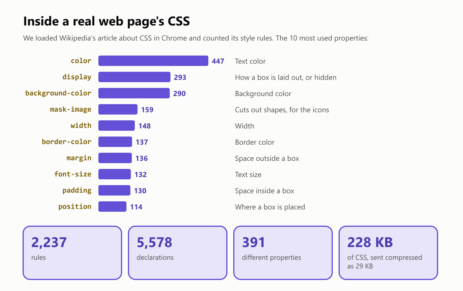
- One page uses 2,237 rules with 5,578 declarations, using 391 different properties.
- The most common property is plain old color, followed by
display, which controls how a box is laid out (or hides it entirely). - The CSS files add up to 228 KB, but they travel over the internet compressed to about 29 KB, and your browser keeps them, so the next Wikipedia page you open loads faster.
CSS keeps growing
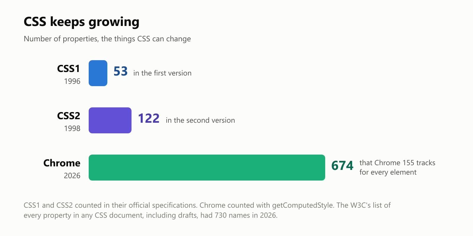
The first version of CSS, in 1996, had 53 properties, mostly about fonts, colors, margins and borders. We asked Chrome how many properties it keeps track of for every single element on a page today: 674. They cover animations, shadows, gradients, columns, grids, scrolling, printing and much more.
There's no "CSS4." After CSS2, the language was split into separate modules (colors, fonts, grid, animations and so on), each updated on its own schedule, so CSS keeps growing a little at a time.
A short history of CSS
In the early web, there was no CSS. Pages were styled with HTML tags like <font color="red"> and <center>, and designers abused tables to lay out pages, even using invisible "spacer" images to push things into place. Every page had to repeat all of it, and changing a site's design meant editing every page by hand.
In 1994, Håkon Wium Lie, a Norwegian working with Tim Berners-Lee at CERN, proposed Cascading HTML Style Sheets. He was soon joined by Bert Bos, who had been working on his own style language, and together they shaped CSS. The first official version, CSS1, came out in December 1996.
Browsers were slow to support it properly. Different browsers drew the same CSS differently for years, and web designers spent much of their time on workarounds. Things improved steadily in the 2000s, and in 2010 the designer Ethan Marcotte coined the term responsive web design, just as smartphones were taking over.
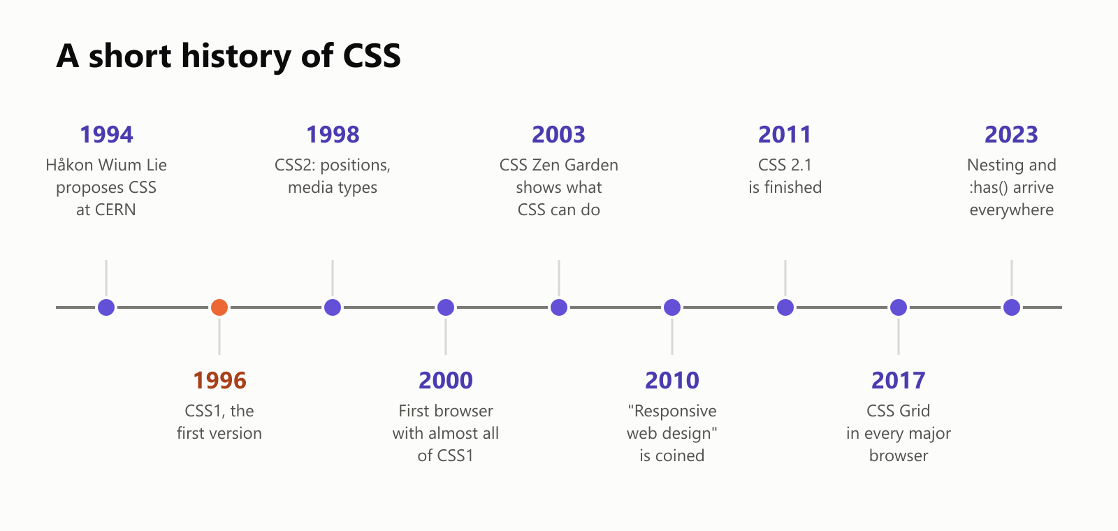
Recent years have brought features designers waited decades for: Grid layouts (2017), variables for reusing colors and sizes, nesting rules inside each other, and the :has() selector (both available in every major browser by 2023), which lets a style depend on what's inside an element.
Common questions
Is CSS a programming language? Like HTML, it's usually not considered one. It describes how things should look rather than giving step-by-step instructions. That said, modern CSS can do surprisingly clever things, like animations and layouts that adapt on their own.
Do I need to learn HTML first? Yes, a little. CSS styles HTML elements, so you need to know what a <p> or an <h1> is. The good news: the basics of both can be learned in a weekend.
What are Bootstrap and Tailwind? They're popular collections of ready-made CSS, so developers don't have to write everything from scratch. Underneath, it's all still CSS.
Can I see a website's CSS? Yes. On a computer, right-click any part of a page and choose Inspect. The panel that opens shows that element's HTML on one side and every CSS rule that applies to it on the other. You can even change values and watch the page update (only on your screen, of course).
Glossary
- CSS: Cascading Style Sheets, the language that controls how web pages look.
- Style sheet: a file, or block, of CSS rules.
- Rule: a selector plus a set of declarations, like
h1 { color: tomato; }. - Selector: the part of a rule that picks which elements to style.
- Property: something CSS can change, like
colororfont-size. - Value: the setting for a property, like
tomatoor32px. - Class: a label you give to elements in HTML (
class="note") so CSS can style them as a group. - ID: a label for one single element (
id="special"). - Cascade: the rules that decide which style wins when several apply.
- Box model: content, padding, border and margin, the layers of every element's box.
- Hex code: a color written as
#plus six digits, like#ff6347. - Responsive design: making one page adapt to every screen size.
- Media query: an
@mediarule that applies styles only on certain screens.
Wrapping up
HTML says what's on a page. CSS decides how it looks: the colors, the fonts, the spacing and where everything goes. Its rules pick elements with selectors and change their properties, the cascade settles disagreements, and media queries let one page fit every screen.
Take CSS away, and even Wikipedia turns into a long list of links with a giant logo. Put it back, and the same HTML becomes a page you actually want to read. To see it on any site, right-click and choose Inspect: every style on the page is right there for you to explore.
Read next
What Is a Transformer in AI? The Idea Behind ChatGPT, Explained Simply
A friendly, jargon-free guide to transformers, the AI design behind ChatGPT, Claude and Gemini. Learn how "attention" lets AI understand words in context, what happens inside a transformer, and why it changed AI so quickly.
 nbkhope
What Is Reinforcement Learning? How AI Learns by Trial, Error and Reward
A friendly, jargon-free introduction to reinforcement learning, how AI learns by trial, error and reward, like training a dog with treats. Watch a real robot learn a maze, see why exploring matters, and learn how it shapes chatbots.
nbkhope
What Is Graph Engineering? How Today's AI Teams Up to Get Real Work Done
A friendly, jargon-free guide to graph engineering, the 2026 idea of building AI as a map of connected steps instead of one big loop. See how today's AI agents work, why small mistakes add up, and how checkers, branches and teamwork fix it.
nbkhope
Comments
Be kind and specific. Comments with links from new accounts appear after a moderator reviews them.